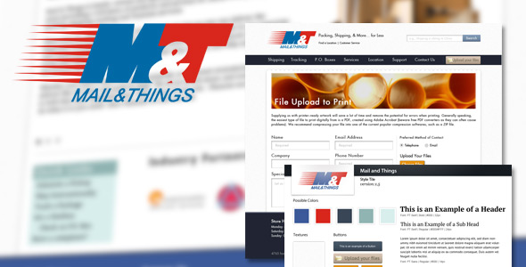
One of our very first clients Mail & Things, located here in Jacksonville, just launched the redesign of their website. What we’d like to do is share a bit about the project and the process we took to help them increase their conversion rates.
The Client:
Mail & Things, a local mailbox and shipping store. You can visit them online at http://mailandthings.com
The Problem:
They felt as if their current solution was outdated and they wanted to utilize the website as an effective marketing tool to drive more foot traffic into the store.
Our Solution:
There were a number of things in their old site that tested well initially when ran through our gambit of usability tests. They also gave us insights on where we could improve on the entire experience for the potential customers. Once we gathered the results from the initial testing round I wasn’t surprised that they were already hitting some pretty solid numbers with their current solution, but there were some major areas that needed improvement. Not only did we improve the overall aesthetics of their website, but we were able to increase their traffic and usability while introducing new features to the site like a custom full indexed support and help section.

A/B Test Ran for Mail & Things Against Their Old Site

Comments are closed.